On this page, you'll find some top-level examples of the various types of sitemaps and structures I've designed for previous clients. Please get in touch if you'd like to know more details or explore how User-Centred Design solutions can help your business and customers.
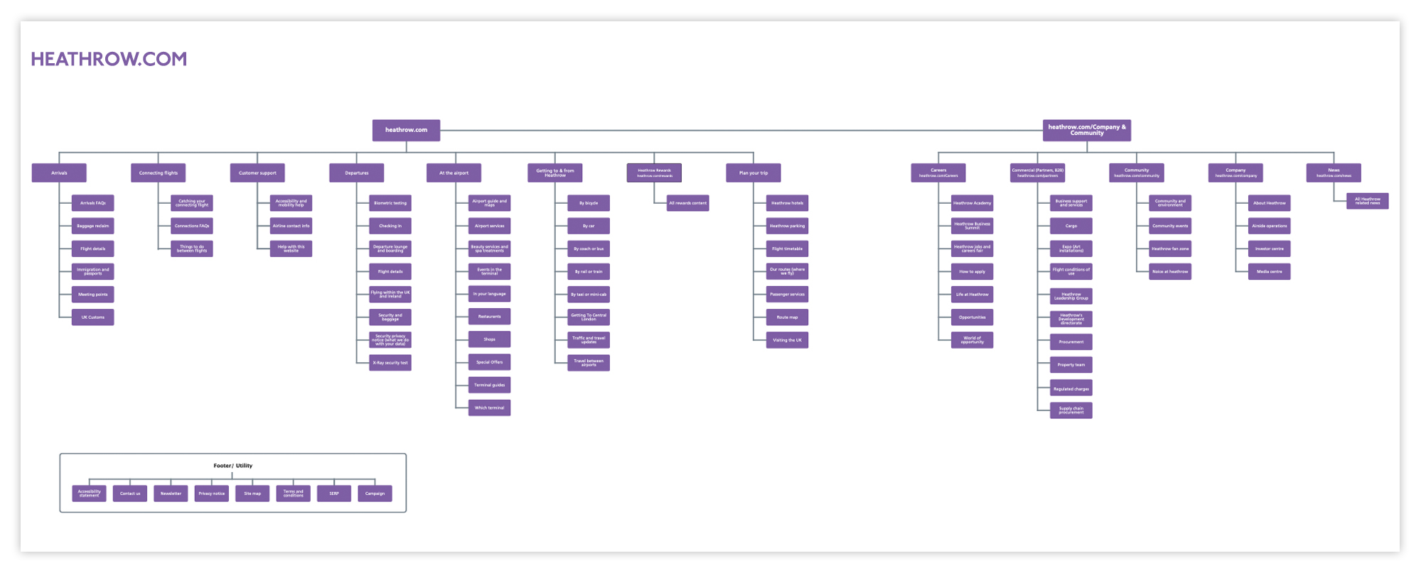
My main goal when restructuring Heathrow.com was to create a streamlined and crystal clear user-centred experience. The original site had well over 3500 pages spread across four URLs and was in desperate need of a re-think. It now sits beautifully under one URL with clear signposting and an intuitive, user-centred navigation system to guide their diverse audiences.
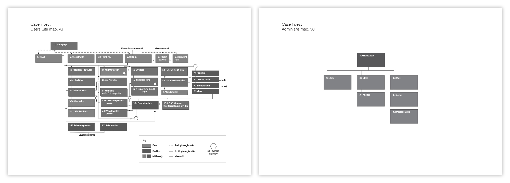
The design for this private investor, networking platform includes a basic User Flow as well as the core site structure. The diagram on the right shows the architecture for the admin console.
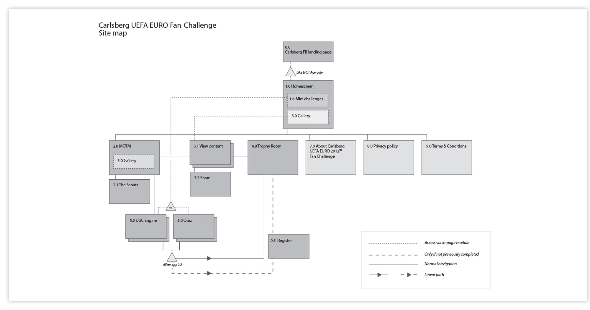
A simple structure for this interactive UEFA competition employs JJ Garrett's standard symbols to describe user flow and access as well as content structure.
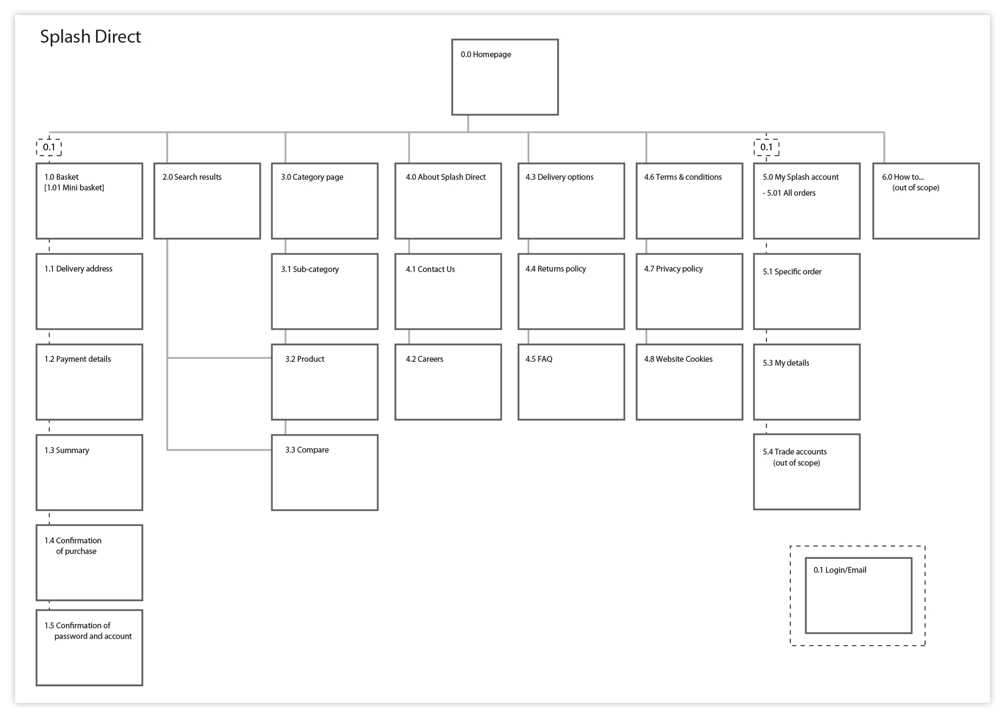
The information architecture for Splash Direct was designed in conjunction with their senior retail team and based on research garnered from customer interviews, competitor evaluation and a card-sorting exercise. This simple structure provided the platform upon which I designed a faceted navigation system and product search.